


Sharing perspectives on the latest trends and tips to help eCommerce brands stay ahead to engage and drive revenue.
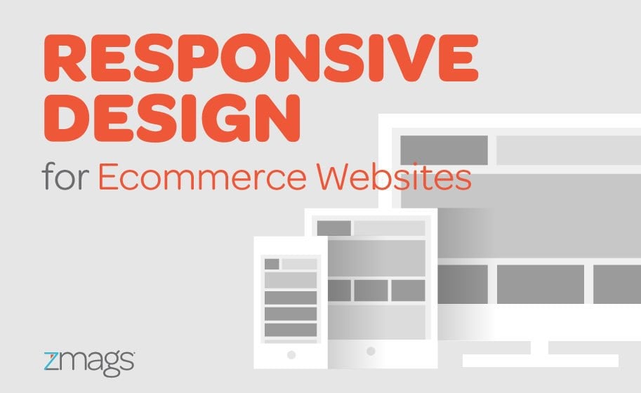
Shopping is Increasingly Mobile
These shopping habits are increasingly shifting towards mobile. Demandware’s recent Year in Review study found that mobile visits in December of 2015 accounted for 47% of total visits to their retailers’ sites, but only 23% of total orders. Visitors will experience your site across a variety of devices: on mobile phones during the morning commute, desktops during the workday, and tablets in the evening. Their experience needs to be consistent across these devices in order to keep them interested and coming back. Yet as Demandware reported, conversion rates on mobile often suffer because it’s difficult for a user to make a purchase quickly and easily. Why is this?Designing Device-Specific Content
Simply stated, it can be a lengthy, costly, and challenging process to design content that’s optimized for each device type. Effective device-specific content requires a lot of iterations and bandwidth to code. First, there are user experience considerations – when visiting on mobile, what does a user really need to see? What do they want to do? Then there’s the need to resize images, adjust text size and line breaks, and even change hyperlinks. Most retailers simply can’t achieve high-performing mobile content because of bandwidth, skill sets, the lack of adequate technology, capital constraints (a.k.a. money), or a combination therein. Yet the faster new content can be previewed across devices, the easier (and thus cheaper) it is to optimize and finalize that content. And the more regularly your site content is updated, the more repeat visits and revenue your site will generate.Better Shopping Experiences on Mobile
Engaging, shoppable content is one clear answer to the mobile shopping problem. Effective shoppable content contains rich imagery that inspires and HTML5 animations that grab attention. It also makes those key visual elements eCommerce-enabled: visitors can click on the products they see and shop without interruption, ideally through a quick view. The shorter the path to purchase, the more likely it is that the visitor will actually buy. When implemented properly on content-rich areas like hero images or your homepage, you’ll see increased engagement, time on site and conversion rates. A nimble shoppable content platform will also cut down on the development time required for device-optimized content. With drag-and-drop creation, merchandisers can easily preview an experience across device types and optimize themselves without any agency involvement or custom coding.
With the right approach to retail content marketing, retailers can close the gap between their desktop and mobile ecommerce conversion rates. Want to learn more about shoppable content platforms? Click here to see Creator, the shoppable content platform that’s easy to use, fast to implement, and painless to integrate.